Problem
How might we make the website for the City of San Jose user friendly.
Solution
Redesign the website by applying established UI standards based on data gathered through user research and continual user testing so that the result is a simpler, easier and user-friendly way for users to find necessary information efficiently.
Role: UX/UI Designer
Tools: Figma, Invision, Optimalsort, Google Suite, Miro, Trello.
Team size: Namrataa BA, Kiri Rasmussen, Darya Sesitskaya. and Carolina Hurtado -myself-.
Date: July’20 (3 weeks)

We conducted a user testing with 4 users, on the current website of sjca.gov with 4 tasks that were more common used by a resident.
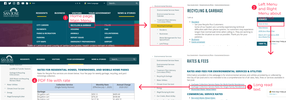
50% of the users fail in the task: “💳 find rates and fees for garbage and recycle for a single family.”
Why?
The experience for them was to heavy, too much information, they feel lost: where to start? where to end? how to follow the steps? "Where I am, maybe I been here before?"
-This users never imagine that they have to find a PDF file to show the rates fees-.
Let's see what else we are going to find as a researchers in this government site?
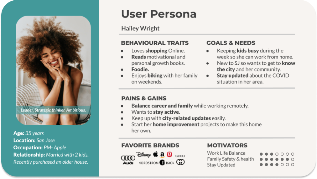
From the User Research we developed our User persona. Meet Hailey Wright!
Next we did a Heuristic evalaution of the existing website

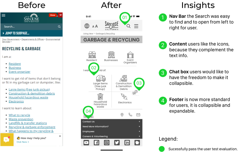
User research revealed that our government site is frequently used to find out about recycling & garbage rates and rules, so we created our Wireflow about this task. Current wireflow for “Recycling & Garbage Rate for a single-family home”
Upon evaluation of the current Information Architecture of the website we found that there are:
Main Navigation: 4 categories, 9 to 15 sub-categories each. Per our user research this long list of choices is overwhelming for the users. There is lack of clarity in the categorizations. Sub-categories are repeated between categories.
After card sorting we re-organized the information architecture.
RESULT:
Main Navigation: 4 categories- 5 to 9 sub-categories each.


8 users
4 Closed Categories.
25 cards to sort within them.
Insights gathered from our card sorting exercise:
•‘Recycling & Garbage’, currently under ‘Living Here’, matched users mental model.
•‘Neighborhoods’, currently under ‘Things to Do’, moves to ‘Living Here’.
•‘Report Issues’, currently under ‘Living Here’, moves to ‘Government’.

To understand and design the path our users would take we created high-level user flows for the 3 main tasks:
1) Find Garbage and recycling rates
2) Schedule free jun pickup
3) Report an issue
Our moodboard is inspired by SJ as the Capital of Silicon Valley. The government site updates their content constantly, focus on the good things of been at San Jose, like events for celebrating their diversity, with festivals like Pow Wow. Also they incentive eco-tech living and business, promote their citizen to use electric cars, panel solar as an example. So we want the Website to reflect the spirit of simple, trendy, eco-tech, friendly and diverse.
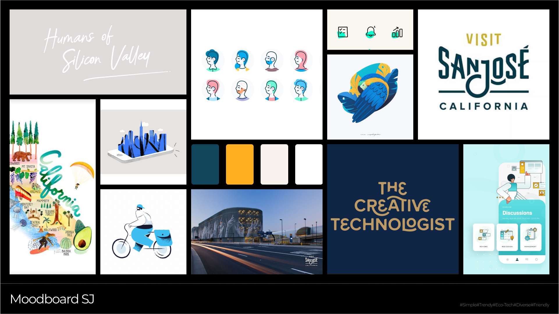

We take the new logo version from pages like "Visit San Jose", Instagram and Youtube channel. The same with the color palette, on the icons, buttons and typography we want to transmit the diversity trendy and eco-tech style.
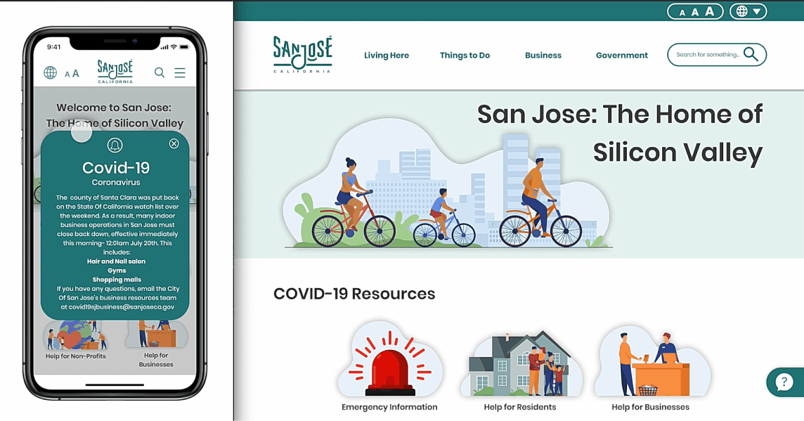
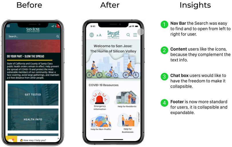
As UI Designers we all did our version of the Homescreens. As a team we voted & picked elements from all our ideas.


As UI Designers we all did our version of the Homescreens. As a team we voted & picked elements from all our ideas.

As UI Designers we all did our version of the Homescreens. As a team we voted & picked elements from all our ideas.