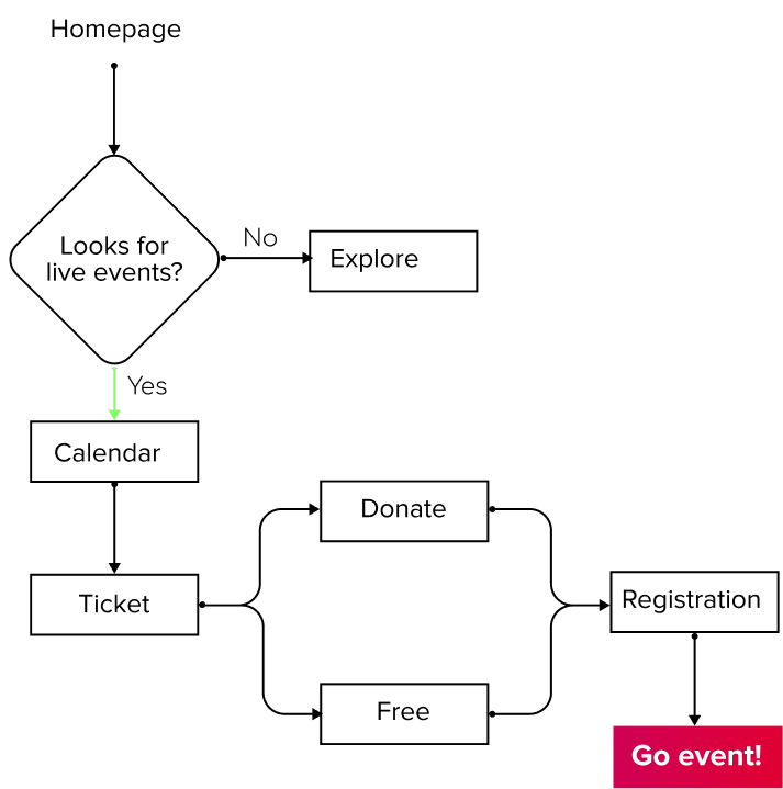
Current site: User Flow
We conducted a user testing with 4 users, on the current website of moadsf.org with 4 tasks on most popular by visitors:
1. Home page see if they can recognice what is about the website.
2. Events section if they can find the calendar and register on a event.
3. Exhibitions visit the gallery exhibition at that time was Mary Lovelace O'Neil
4. Memberships become a member.
50% fail the mermbership task and 25% of the users fail in the task “find an live-event for august.”
Why?
The experience for the user wasn't engaged, in words of one user
"Actually, I don’t really like the page's layout... main info is too small. At my laptop I need to zoom in or my eyes need to take closer to see 🔎."
Can you find the ticket icon 🎫 for register on event in the current website?